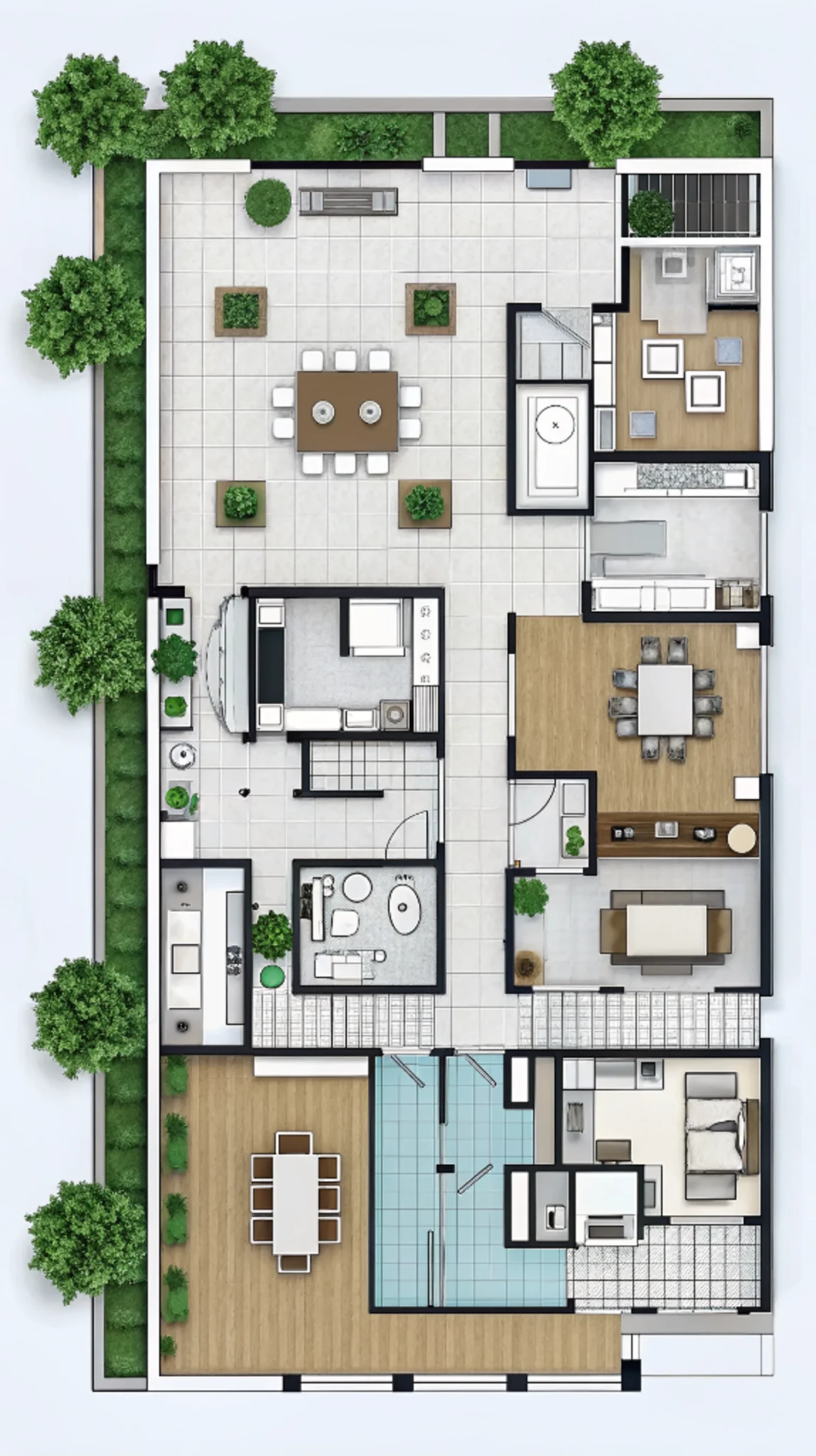


Are you tired of gray, beige, and white everywhere in your home? You’re not the only one. Many people want more color but worry about clashing shades. The biggest dilemma is finding the right mix where colors work smoothly. This guide will show you how to add color to your space without creating a mess, bringing new life and balance to your home.
Find Your Perfect Interior Color Inspiration
Finding the perfect interior color inspiration starts with identifying what you love and what you need to work within your space. Begin by focusing on elements that won’t be changing anytime soon, such as flooring or kitchen cabinets. Look for inspirational photos online that feature similar elements and see which color schemes appeal to you. By observing how colors interact in these settings, you can start to visualize how they might work in your own home. Once you’ve found a palette you love, don’t hesitate to replicate it. This approach helps ensure that your final color scheme feels cohesive and personalized. It’s a practical way to create a space that truly reflects your style, blending neutrals with bold, saturated colors for a balanced and vibrant look.
The Origins of Color Theory
Color theory has its roots in the 17th century when Sir Isaac Newton first discovered the spectrum of colors by passing light through a prism. This groundbreaking observation led to the creation of the color wheel, a tool that has become essential in understanding how colors interact.
The color wheel is a simple yet powerful tool that vividly illustrates the relationships between colors. At its core are the primary colors—red, yellow, and blue—which serve as the foundation for all other colors. These primary colors cannot be created by mixing other colors. By combining them, secondary colors like green (yellow and blue), orange (red and yellow), and purple (blue and red) are formed. Further mixing of primary and secondary colors results in tertiary colors such as yellow-orange, blue-green, and red-purple.
The color wheel helps us see how these colors can be combined, contrasted, or harmonized, making it an essential guide for anyone looking to create balanced and pleasing color schemes in interior design. Whether you’re choosing paint, fabrics, or decor, the color wheel can help you make confident and creative decisions.
If you’re renovating your home and can’t decide between paint or wallpaper, click here to read this article for help.

Mastering the Principle of Interior Color Schemes
Analogous Colors
Analogous colors are those that sit next to each other on the color wheel, such as yellow, green, and blue. In interior design, using analogous colors creates a harmonious and cohesive look. The beauty of this approach lies in the subtle blending of colors, resulting in a smooth, non-jarring visual experience. For example, combining floral patterns with stripes in shades of yellow, orange, and red exemplifies the effective use of analogous colors.

Complementary Colors
Complementary colors, when used wisely, can make a bold and striking statement. These colors are directly opposite each other on the color wheel—think red and green, blue and orange, or purple and yellow. The contrast between these pairs is powerful, but when used sparingly, complementary colors can add a refreshing and visually appealing touch to a room. For instance, a gray-green room accented with a deep red armchair draws the eye and emphasizes key elements of the design.
Triadic Colors
Triadic color schemes are a more intricate form of complementary colors. Instead of using direct opposites, triadic schemes involve one color paired with the two colors adjacent to its complement on the wheel. This creates a vibrant three-color harmony, such as red, lime (a yellow-green), and turquoise (a blue-green). For example, adding a magenta accent to an orange carpet and lime leaf-patterned fabric can create a dynamic and balanced look.
Monochromatic Colors
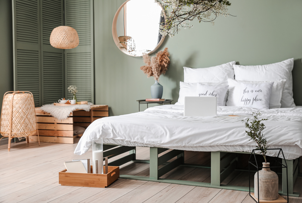
Decorating a room with varying shades of a single color is known as a monochromatic scheme. The key to achieving a beautiful monochromatic space lies in the thoughtful use of different shades and the combination of various materials like linen, cotton, silk, and wood. A serene blue-toned bedroom, for example, can evoke a sense of calm and tranquility, making it an ideal retreat.

Accent Colors
Accent colors are an excellent way to add life and vibrancy to a space, breaking the monotony of monochromatic or neutral schemes. These colors are typically introduced through cushions, small rugs, artwork, and other accessories, serving as visual highlights and energizing elements in a room. However, it’s important to use accent colors sparingly—too much can overwhelm the space. Sometimes, a simple orange vase in a blue-toned room can create a surprisingly impactful visual effect.
Neutral Colors
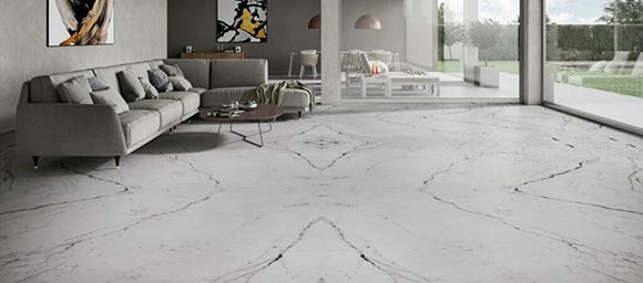
Neutral colors are a staple in interior design, even though they don’t appear on the color wheel. These include black, white, gray, brown, beige, taupe, and ivory. Neutral colors convey comfort and tranquility, making them essential in any designer’s palette. Popular neutral schemes today often feature brown, light tan, beige, taupe, and ivory, but gray remains a standout choice. As a true neutral, gray sits between black and white and pairs effortlessly with any other color, offering a versatile backdrop that complements other colors without overpowering them.
Cool Colors
Cool colors, centered around blue on the color wheel, include purple, blue-violet, blue, blue-green, and green. These tones tend to recede visually, making spaces feel larger. To give a small room a more expansive feel, a classic solution is to paint the walls in a cool, light color. In the Northern Hemisphere, cool tones work best in south-facing or west-facing rooms, while in the Southern Hemisphere, they are ideal for north-facing or east-facing rooms. These cool tones bring a calm and soothing ambiance to warm, sunlit spaces. A cool-toned living room might draw inspiration from Scandinavian design, blending soft blues, beiges, and whites.

Warm Colors
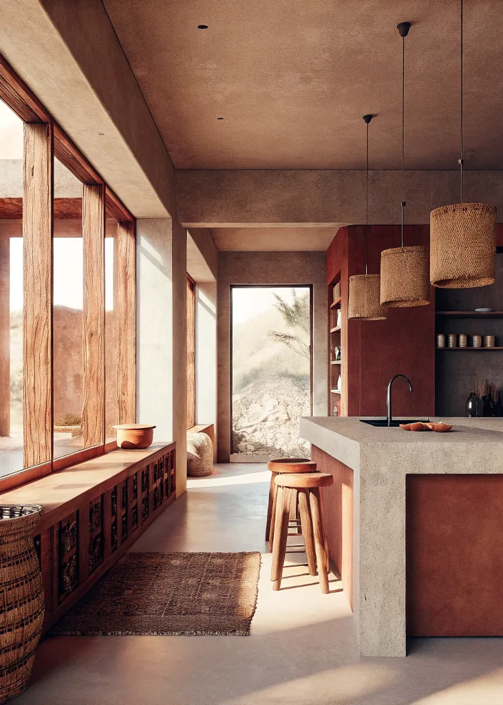
Warm colors, centered around orange on the color wheel, include bold hues like red, orange-red, orange, yellow-orange, and yellow. Reddish-purple and yellow-green are also often considered warm colors. These tones tend to advance visually, making spaces feel cozier and more inviting. For instance, painting the far wall of a long, narrow room in a deep red can make it appear closer. Warm tones are ideal for north-facing and east-facing rooms in the Northern Hemisphere, and south-facing and west-facing rooms in the Southern Hemisphere, where they add warmth to spaces that receive less direct sunlight. Luxurious velvet curtains, for example, are a perfect choice for a warm-toned living room.

Vivid Colors
Vivid colors are the high tones on the color wheel, radiating energy and life. These colors aren’t simply made by adding black to darken or white to lighten; they embody a powerful force of color. However, their use requires caution. For instance, painting a bedroom lemon yellow might make it too bright, making it difficult to relax and fall asleep. A combination of fruit green and magenta, for example, belongs to a high-tone, bright color scheme that should be used thoughtfully to avoid overwhelming the room.
Harmonizing Patterns, Textures, and Colors in Your Space
A successful interior design is one where, as people look around the room, they discover a delightful combination of colors, patterns, and textures perfectly harmonized. When selecting colors and patterns for different textiles in a room, it’s important to consider the flooring as the foundation. Key textiles like carpets, bedding, and throw pillows should be chosen based on the floor’s color and texture to ensure a cohesive look.
Can’t decide whether to go with tiles or hardwood flooring for your renovation? Click here to get some helpful advice in this article.
For example, a carpet can either match or contrast with the floor, while bedding can harmonize with the carpet or floor to create visual continuity. Throw pillows can add layers of contrast or complement the floor’s texture. Additionally, curtains should match the wall’s color, with their patterns selected to blend naturally with the room, ensuring that the overall design feels balanced and integrated.
Choosing the right colors for your home is important. It helps show your style and makes your space feel personal. Start by learning the basics of color theory. Try out different combinations. Mix patterns and textures carefully. This way, you can create a lively look without clashing colors. Don’t be afraid to try new ideas. Fresh colors can turn a plain room into something special. Remember, color sets the mood in your home. A good color scheme can make your house feel bright and inviting.